Hello again! Today a visit to 2nd tier of themed entertainment: Seaworld Orlando.
I actually really like Seaworld Orlando. Views on animals in captivity and recent controversies aside, the park itself is a really pleasant and attractive place to be with some fantastic coasters (if perhaps less than fantastic other rides). While I often say I grew up at Walt Disney World, since it was 15 minutes away from my house and both my parents worked there and we were therefore there very often, it’s actually probably more accurate to say I grew up at Seaworld. My house was within walking distance of the front gates (not that I ever actually have walked there – should try that some time), my family loved the place because of all the shows and as a nice place to walk, and we probably were there a good deal more than Disney- at least until I became a tad older and wanted to ride more rides. Keep in mind there were nearly no rides at Seaworld during this period – only the sky tower and Wild Arctic. Later there was Journey to Atlantis (which I have ridden a record 13 times in a row without disembarking) and Kraken (which was my first “big kid” roller coaster). But there was an amazing playground! (which the good part of doesn’t exist anymore). So lots of fond memories, lots of experience with walking around and seeing the sights, lots of sadness around the lack of water-skiing shows these days.
Random thought: I feel like one of the biggest strength of the Seaworld parks (aka the Busch parks) has always been the prevalence of beautiful landscaping and I would love to see a renewed focus on that.
The Seaworld parks are the only true discovery parks I know of left in America with Epcot slowing becoming more and more a traditional Disney property and I think they really should embrace that. Not only would it be more appropriate for the smaller budget the parks have instead of crippled attempts at making a Universal or Disney scale immersive area (I’m looking at you Antarctica) but it could really serve as a differentiator. Play up the presentational design (this works great with dark rides too – which the park would benefit hugely by), play up the entertaining education, keep a focus on world-class experiential roller coasters, and you can really attract a lot of new guests and also reduce your reliance on animals – which less face it, is just going to get less popular over time. I’m afraid that Seaworld is going to try to turn itself into some sort of six flags, and at least in the Orlando market I don’t think that will work -then you’re just a crappy Disney and Universal and no one wants that.
Anyway, I digress. (bad habit, sorry). Today’s post is about redoing the entrance for Seaworld Orlando. The whole park could use a general navigation simplification and refocusing, but let’s start where it matters.
As it stands now the entrance area is kind of a mess. For a start theres two different entrance areas, three if you count the ones used for special events and camps, and I really think there should just be one main one with the others for emergencies or special circumstances only. Another huge problem with the entrance area (specifically the plaza) is that there is no real organization to the area. There’s no focal point. There’s no clear indication of which way you should go. And then there’s the actual aesthetics. The first thing you see after going through the turnstiles is a white stucco side wall of the gift shop and it just kind of feels like you’re being squeezed through an area you shouldn’t be. And then the gorgeous bay scene at the front, isn’t visible at all from the actual entrance area, is overshadowed by the wide view of the parking lot, and just the whole thing is a bit of a mess. An entrance area should be a gathering and orienting place, a place that’s exciting, a place that builds atmosphere and excitement. It’s the first and last thing a guest experiences, and really should make an impression.
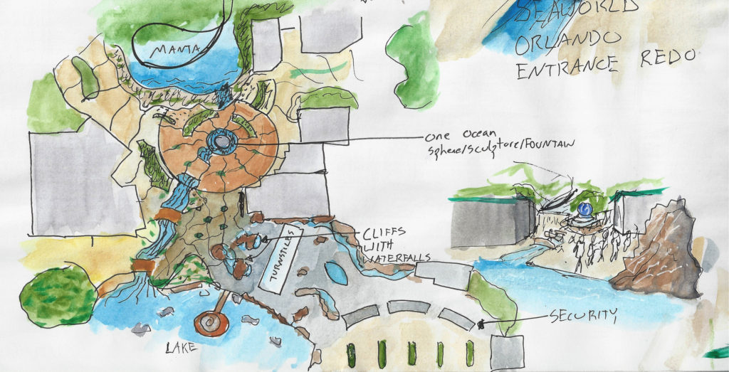
With all that in mind I present my plan (not to scale).
The goal of this plan is to address all the issues I’ve outlined above.
For starters I really wanted to play up the connection to water. The park is called SEAworld for goodness sake. Water will be near or surrounding the guest from the moment they step foot out of the parking lot.
The bay remains, though the buildings that border it are now gone. Security has also been moved away from the turnstiles. Security these days takes up so much time and space, and really kind of ruins the entrance progression at theme parks, and I wanted to give some space after that hassle and also allow a lot more space for it to occur to expedite the process. After exiting security that’s when the real experience begins.
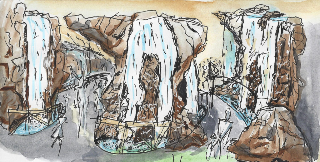
The guest is surrounded by pools of water and rock work, and a narrowing of the space that provides a quiet area that leads to the turnstiles. After the turnstiles the guest enters a beautiful area of different kinds of rocks or perhaps coral with waterfalls and pooling water around them everywhere. The idea is to really calm the guest down while still filling the area with energy and emphasizing the idea of water. Emphasizing the idea that this is a presentational discovery park, the paths, the railings, etc aren’t necessarily what you’d find in a traditional themed area: perhaps much cleaner and more modern. The rocks and waterfalls don’t necessarily try to convince the guest they’re in, say a canyon, they’re there for the aesthetic and emotional purposes instead. This also hides the butt ugly side of the main gift shop we need to get past. Here’s how I imagine it:
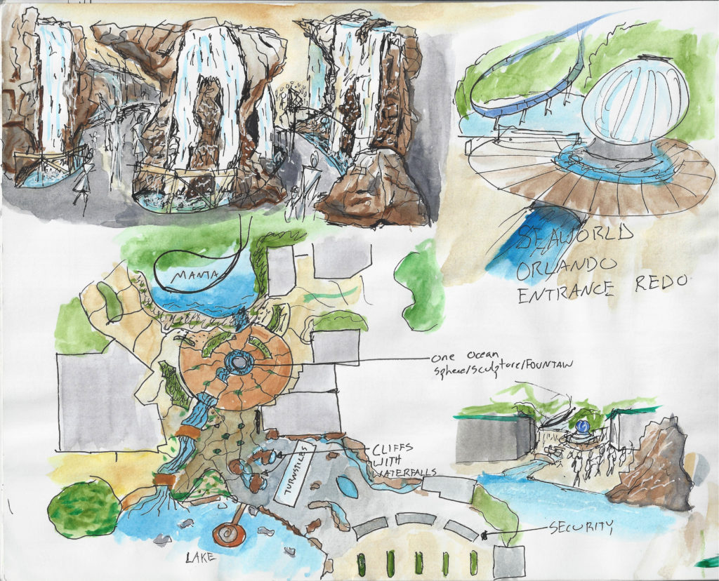
Finally the guest emerges from the forced compression into the new expanded and opened plaza. The starbucks/bakery building has been removed and the plaza is expanded. In the center the focal point is a water sculpture (if you could make a giant sphere out of water I think that would be perfect: it’s kinetic and would echo the “one ocean” theme that Seaworld likes to emphasize). The backdrop is the gorgeous manta lagoon – with some additional beach and tree enhancements. Landscape is a continuing theme here as a sandy tidal stream connects the lagoon to the fountain and the bay in the front of the park. Trees and rocks have been planted and constructed to block the view of the parking lot once inside. Bridges cross the stream to lead to guest relations. Towering palms dot and shade the plaza. The buildings in the area get sleek new blue metal and glass facades (not pictured). If I could run a water curtain down the side of them I would (seriously waterfalls on glass walls are cool people lol) Another benefit of the opened area is now two clear paths that lead into the park. Also not pictured, the dolphin nursery would be moved somewhere else in the park and that spot occupied by a new bakery and coffee spot with plenty of seating to view the sights nearby. This area would flow smoothly into the promenande/boardwalk section (I can’t remember the actual name of the area off-hand). All of these ideas were just a couple of sketches I did on a page pretty quickly one day and here is the complete page.
And so that’s the general idea. I really like the concept and want to expand on it. I also have one other idea for the entrance – that involves instead of rocks and waterfalls involves more glass walls and ceiling/roof with water flowing on and off it that I would love to explore too.
As always I love comments and feedback and would love to know what you think. Thanks for stopping by!


