The Big Break Foundation: Experts at Relational Experience Design

You never forget your first IAAPA. Between the thousands of flashing lights, the mixture of Dippin’ Dots and fog juice wafting through the air, and the slow building sensation that this must be what war is like —  it can be a lot. I first attended IAAPA over half a decade ago and that experience, while memorable, I can’t say was exactly positive. It was overwhelming, confusing, and surprisingly lonely. I left unsure if I even belonged in this industry. That experience could not stand in more contrast to my most recent IAAPA experience in November, in no small part thanks to the stellar work of the Big Break Foundation. 

The Big Break Foundation was founded a couple years ago, at the height of the global pandemic, by themed entertainment industry veterans Chuck Fawcett and Patrick Kling. Run by executive director Monai Rooney, the organization seeks to improve inclusion, diversity, equity, and accessibility throughout the location-based industry. But from where I stand what the organization really excels at is relational experience design. It looks at the entire industry from above, and in a truly innovative way focuses on both the guest experience and that of the behind-the-scenes talent and identifies ways to improve the experience for everyone, regardless of where they exist in the system. 

The Edutainment program is a perfect case study of this approach. I, along with 49 other students and recent graduates, from writers to mechanical engineers, from college sophomores to mid-career transitioners, and people from all over the country and world found ourselves on a whirlwind immersion program into the attractions industry. All of us had stories of barriers that we kept encountering: lost internship opportunities due to the pandemic that we were no longer eligible for, convoluted international visa requirements and companies unwilling to deal with them, possessing odd combinations of skillsets, unsure how to communicate our value. And over the course of the week I glimpsed a shocking amount of opportunities begin to unfold and the edges of some of the barriers begin to be sanded off.

Throughout most of the history of the themed entertainment industry, making your way in it has been rather difficult. It’s a career that people fall into through luck or who otherwise have had to navigate a dark maze of unmarked doors through sometimes dubious means. It’s often been a hostile climate: people forced to trudge forward for long hours in pain and discomfort with no map, not sure of where they’re going, where only the most obsessively driven, competitive, and frankly, privileged succeed. In short, it’s a place where most of the effort of experience design has been placed on the product, not on the halls where it’s created. But it doesn’t have to be that way and a new generation is looking to change that. Most pros that have been in the themed entertainment industry a while accept that the better the guest experience is the more money there is to be made. People want to be in places that are great to be in. What the Big Break Foundation recognizes is that axiom holds just as true behind the scenes. 

The core of the Edutainment Program is a partnership with IAAPA that provides admission to the IAAPA Expo, EDUSessions, and a 1-year Young Professional IAAPA membership for free, to each of the 50 participants. That alone is huge. Tickets to the Expo are not cheap and the learning and networking opportunities contained within are invaluable. But Big Break goes way beyond basic access and curates an entire weeklong experience, a crucial component of which is community. A newcomer’s first exposure to this industry can often be formidable and isolating. As program participant and industrial designer Gabriel Nunez explains, “At times I felt out of place…a sense of alienation crushed me. How could I join the industry when I come from middle-of-nowhere, Costa Rica?…I found comfort in the rest of the Edutainment Pass Program participants…Thanks to all of them, I ended up feeling like I do belong, we all belong, no matter where we come from.” The Edutainment program combats the isolation of being new by curating a community before the expo begins, with online discussions and multiple meetings, so even on Day 1 you feel just a little less alone. 

Once the expo does start, the program, this year run by the incomparable production manager Sara Needham and sponsored by B Morrow Productions, offers a treasure-trove of experiences that unlock IAAPA in ways 2016 me could never have imagined: Tours of the show floor from industry veterans happy to answer any question you can dream up. Nearly a dozen intimate discussions from even more industry experts happy to share their wisdom and chat one-on-one to answer questions. Schedules and directions to all the mixers and meetups you might not have even known were happening or existed. An invite to the Valtech party. And above all a community to do it with. 

One aspect I love about Big Break’s approach is its individualized, generous spirit. A spirit that flows directly from their focus on IDEA principles. Take for example Sara’s story. They were a participant in the program last year and because of it were able to land an internship with one their top choice companies, but alas there have been additional barriers. 

“Being a international graduate student has meant finding full-time employment comes with the added requirement of visa sponsorship…this extra requirement has made my own personal search very difficult. After my internship ended I reached out to Monai and Big Break Foundation to see if there was any way I could volunteer my time while looking for my next opportunity…Big Break gave me a focus, a chance to build some new skills…I became the point of contact for these students [and 33 industry professionals who spoke to them], building an exclusive Edutainment Program schedule for their IAAPA week…sourcing and scheduling chats…organizing booth volunteers…even speaking to the media on behalf of Big Break Foundation. In a time where I couldn’t find my next step and wanted to give up, Big Break Foundation put me in a position to keep moving forward and serve my community.”

This generous, individualized spirit extends to everyone the foundation encounters. The Edutainment program regularly invites people it meets on the floor to relevant events and encourages participants to do the same, when the circumstances allow, because they recognize the goal is creating a better experience for everyone — lifting everyone up. The trailblazer chats were formed through requests of the participants, of people we  directly asked to hear from. And Monai and Sara both make it a point to get to know every participant by name, learn what they want to do, and try to connect them with the people that can make it happen: an attitude quickly mirrored by all the attendees.

Of course the Big Break Foundation knows that there are so many more people out there that could use a hand than the 50 they’re currently able to sponsor. In fact, the Edutainment program is only a small portion of the work they do throughout the industry to try to create a welcoming experience for everyone. This is where their relational experience design expertise comes in. The Big Break Foundation goes beyond quick fixes, and even beyond the model of guest service, to the very core of how experiences are created: how we relate to each other, our environments, and the structures we operate within. Through the principles of Inclusion, Diversity, Equity, and Accessibility, the Big Break Foundation seeks to transform the guest and employee experience alike into something better for all. 

I don’t think a lot of people recognize the mental toll being a newcomer, being marginalized, or just having rotten luck can take on a person trying to make their way. Nunez talks a bit about this, “I applied because not many believed in my dreams of becoming a ride designer when I was kid. I applied to show there’s people outside the US with ambition and talent willing to give it their all to become part of this industry. I applied so that one day another student with similar aspirations can look back and see that our voices can be just as strong as anybody else’s. That no matter the barriers that being queer Latinos pose, we will make it.” Many of us in the program have dealt with the lack of confidence being on the outside can bring. I feel echoes of Gabriel’s journey in my own story. One of the reasons I’m pursuing a career in themed entertainment now and not 15 years ago is because as a closeted trans teen I was bullied for loving theme parks, faced with homophobic derision about it, and didn’t have the confidence to say “this is what I want.” Much like Gabriel I hope that my presence now might help some other person who feels afraid to go after what they want. IDEA principles and the relational experience design expertise Big Break provides help cultivate an atmosphere where people like us can feel we belong.

People often get scared or defensive when the IDEA words pop up. Such big aspirations must mean a big change. Change is scary. And sure there is no denying there’s a lot to work on. But really it’s just about helping people: about being kind, generous, welcoming, and curious. It’s about being as intentional in crafting the experiences between each other as we are in creating the ones made out of concrete and steel. To make room for everyone, as the monorail announcement goes.

All week I heard story after story about the opportunities this approach was able to unlock for my peers. Wren Sullivan, another participant and concept artist puts it well, “Applying for Big Break Foundation is one of the most beneficial things I’ve done. All of their fireside chats with industry professionals really gave me the opportunity to understand the industry more, network on a closer basis, and reconfirm that this is the industry for me…I was overwhelmed by the amount of networking that happened amongst all of the Big Break Foundation scholarship receivers.” Matthew Curnutte, participant and mechanical engineer echoes the sentiment, “I’m so glad I got selected. I got way more out of IAAPA Expo through Big Break Foundation than I would have going on my own. “

Big Break asks, “what if we paid as much attention to the experience between each other as we did to the one in Revit?” What if there were people around every corner looking to make your journey just a tad more easy and pleasant, one where you’re given a map and aren’t stuck in line, so that you can save your energy for the actual job. Big Break gives new tools to improve the guest experience in ways that have been historically overlooked and for the first time applies the techniques of great experience design to behind the scenes creators, operators, and those that aspire to become them. It does this by being holistic, by not focusing on one individual detail or demographic, but by focusing on how all the elements work together, just as the best experience designers do, to make a seamless experience for everyone. I feel so grateful to have gotten to be a part of their Edutainment program this year, and so excited by the energy I witnessed among my fellow participants. There’s so much fantastic talent on the horizon and Big Break Foundation is making all of our journeys a better experience.

The Fallacy of Immersion

Immersion has been the buzzword of the themed entertainment industry for a little over a decade or so. We’re in an arms race where every new project attempts to one-up the last by increasing the ‘immersiveness’ by another factor. Bigger, more enveloping, more detailed, and especially: more real

While some of the projects this has resulted in are phenomenal achievements, and indeed some of my personal favorites, I really find it peculiar that realism has become so centered in the process. In fact, ‘immersive’ and ‘real’ are often treated as if they’re synonymous and thus to make something more ‘immersive’ necessarily means you must make it more ‘real’. But one only needs a cursory understanding of operations to realize that realism and guests’ wants and needs are often in direct conflict with each other.

Continue reading “The Fallacy of Immersion”

What Sondheim Can Teach Us About Experience Design

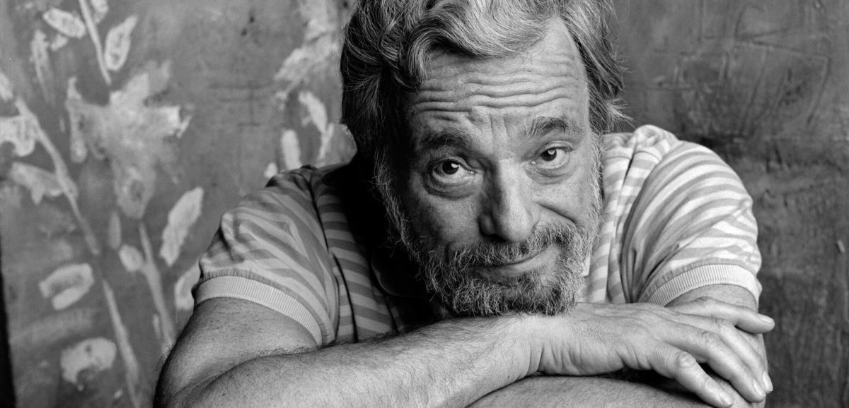
Photo Credit: https://www.nytimes.com/2021/11/26/theater/stephen-sondheim-dead.html

Stephen Sondheim, famed musical theatre composer, lyricist, genius, and a personal idol of mine recently passed away. His death has recently caused me to reexamine a thought I’ve had from time to time: that rides are akin to songs.

It might sound a bit strange at first to suggest that rides and songs are the most closely related storytelling mediums but consider their raw components. Music at its most basic level, stripped of lyrics, is a progression of sensations you feel. Rides at their most basic level, stripped of plot, are a progression of sensations that you feel. A simple unadorned coaster might be the equivalent of a single melodic line, one surrounded by scenery the equivalent of a full symphony: full of color, texture, and harmony. Both use these sensations to shape an arc of emotion within you — to tell stories. This is different than most movies, plays, books, and (many) games — which primarily use dialogue, plot, and prose. Those forms of storytelling speak to your mind. Music and experiences instead speak directly to your body. 

Continue reading “What Sondheim Can Teach Us About Experience Design”

Theme Park Musing #12 – Experience is in the Present, Story is Not

Here’s a thing I’ve been thinking about. Most forms of story are inherently past-tense when you start looking at them with an experiential lens. When we talk about movies, the written word, and even most live performances – they’re past tense…even if they’re written or staged as if they’re in the present tense. If I read a book written in the present tense…like obviously those words aren’t appearing in front of me in the actual present. Presumably the book is a log of some kind that might have been written contemporaneously, but it still exists in the past. The present tense narration is merely a storytelling tool to make it feel more engaging. Same with future tense, though who the hell tells stories in the future tense.

But experiences INHERENTLY happen in the present. They cannot happen in the past, and they can’t happen in the future. They happen NOW. What exists in the future or the past is the STORY about that experience. I have an experience and then when I remember it my brain recreates it my head based on a STORY that it has constructed in the immediate aftermath. 

What this means is that when you’re storytelling for experiences, what you’re really doing is creating proto-stories. You can’t tell a story in the present, because the act of “telling” it puts it in the past. It put distance between the events and the participant. So if you’re trying to create an immersive story what you really have to does supply the building blocks of the story, the raw experience, and supply them in such a way that the story you want to tell will be created in the audience’s mind later.

That’s what experiences are like in real life. You get dropped into a situation, maybe with some prior knowledge, and have to piece together a narrative after the fact. In the present the narrative isn’t necessarily clear. That’s what makes you feel immersed and in the moment. Otherwise any attempt to make an experience is going to feel like “hey remember this other thing?” Or “hey look at these pieces of art”

What this means in practice is difficult to pinpoint, it’s not just as simple as “don’t explain things” or “there is no story”. Even people who are really good at doing it can have trouble doing it on a consistent basis. It’s not how the human brain works. The human brain makes stories and narrative out of everything it sees. The human brain doesn’t remember reality. It remembers the story about the reality. The task of the experience designer is to remember a story of some experience that happened to them, and then work backwards and ACTUALLY remember the pieces of reality that built that experience, so the story can be literally recreated for someone else, not just told to them. And of course it’s extra difficult because you’re not remembering at all, you’re trying to create something new. In some respects this is what “attention to detail” means in an experiential context.

When Marc Davis said his quote about theme park designers not telling stories, but creating arcs of experience, he was sorta right. The reason he didn’t think they were telling stories is because at that time the designers didn’t necessarily pursue storytelling with the kind of intentionality that a lot of us want to pursue today. Or they just told very, very archetypal stories. But they were doing it intuitively. (Which tbh is somewhat of a blessing, because approaching it with a specific outcome in mind makes the task a hell of a lot harder). And honestly the best attractions are clearly the ones where the designers were able to just tap into intuition and just flow. But I think it’s still useful to know what’s actually happening, so you internalize it. Like jazz music.

TL;DR I think the takeaway is that in order for something to feel immersive it needs to feel like “This is happening NOW.”  This is why rides that are environmental, with good transitions and a sense of actual space feel more immersive because the experience is plausibly happening in real time NOW. As opposed to being set pieces that we’re gliding past. And rides  that are more vignette-like and still good tend to be non-fiction or feature a lot of narration to tie it together (but not narration that just tells you what you’re looking at, narration that comments on the action instead). This is why experiences that don’t require you to pretend to be someone else feel more immersive, because there’s a sense of this is happening NOW vs this is an experience I’m entering. How much distance is there between me the guest and the actual physical elements of the story? Is this happening NOW and is this happening TO ME.

This is why creating elaborate backstories of a place can be a useful design tool. But only as a design tool. There are other ways to do it, particularly if you’re working on a small team, but if you’re working on a big team and want to create the building blocks of experience  that will add up to the story you want, you can create elaborate detailed backstories for every building and their inhabitants, stories that all relate to your big theme, and then the design of those buildings will reflect those stories, and then in theory those details will get reconstructed back in the audiences mind in roughly the way you intend. But the minute you start actually saying to the audience “here’s the baker’s house and the candlestick maker’s house” you actually end up shooting yourself in the foot, lodging your experience in the past and not the now. This is only one way to approach the problem, set dressers on films will essentially do the same process but its much more intuitive, quick, and less formalized. The main reason to formalize it though is in experience design teams can often large and hastily added details are a lot rarer – most need to be predesigned and built out of solid steel. 

I think this post is at the risk of soon rambling off and contradicting itself if it goes on too much longer, so I’ll stop here. It’s still a little hard to articulate. What I’m trying to get at is that story creation for experiences is indeed different than like writing a movie or novel. It’s a rawer form with less connecting tissue. And the impulse to provide too much connecting tissue can really do it a disservice. 

Note: I’m pretty sure Joe Rohde has said something partially to this effect, especially re creating the building blocks of story and not actually story, but twitter and Instagram are the opposite of conducive to searching for this.

Theme Park Musing #11 – What Actually is Themed Entertainment?

I’m starting to think that “good” themed entertainment design is actually a combination of two distinct design philosophies that are actually separate, just tend to occur together.

One is like themed entertainment design “proper”. Perhaps Narrative Design is a good word? This is the art of imbuing narrative and story and values into the built world.

But there’s also the philosophy of experience design, though that term has been so co-opted by UX people I think I need to distinguish it as like “radical holistic experience design” or “emotion design” or something.

And when we think about traditional theme park/themed entertainment design we’re really talking about those two things combining together. A theme park is a place that has been designed to tell stories about the world and reflect a value system back at us, but also meticulously crafted to create as frictionless an experience as possible, with specific guest emotions and states of being in mind.

Continue reading “Theme Park Musing #11 – What Actually is Themed Entertainment?”

World Building: Themed Experiences are Tools of Social Change

Sparkling lights, cheery music, the smell of popcorn, cotton candy, and crisp churros floating through the air — bright colors, immersive worlds, elaborate spectacles from dawn past dusk. This is the imagery that’s conjured up when theme parks and other immersive experiences are discussed: fun, frivolity, and above all a disconnection from the real world. 

Some topics that probably don’t come to mind? Infrastructure, transportation policy, civic planning, technological development, history curriculums, gender politics, race relations, and a myriad of other issues normally reserved for some domed building far, far away.

There is a widespread belief that theme parks and related experiences are simply repositories of fun, devoid of politics. But that notion is simply not complete. Themed experiences are absolutely fun, entertaining places where people go to decompress. But they also play a gigantic role in shaping culture. These experiences are the physical repositories of our shared histories, mythologies, hopes and dreams. They are physical models that the world outside the berm looks to for inspiration. 

Continue reading “World Building: Themed Experiences are Tools of Social Change”

The Big FAT Problem in the Attractions Industry

Photo Credit: https://orlandoinformer.com/blog/rides-at-universal-for-larger-guests/

This essay contains mentions of weight numbers, percentiles, and size-related traumatic experiences and may be triggering to those with such experiences or eating disorders. 

You’re 12. You’re excited. You’ve waited all year for the summer to come and school is finally out! You and your friends are headed down on a vacation to an exciting theme park you’ve been seeing television ads for weeks about. You’ve looked up ride videos online, gazed longingly at the park map, and you know exactly what you want to do first: that big flashy coaster right at the front of the park. It’s so tall, and, ominous. You can’t wait.

The day finally comes and you and your friends are practically spurting out steam you’re so excited. You get to the park right as it opens and zoom straight to the coaster. The line is already an hour long. Undeterred, you persevere. One hour later, feet sore, your reward is in sight: the experience you’ve dreamt about for god knows how long, the thing you’ve seen on tv for countless weeknights. The gates open and your friends eagerly scurry into the open car and you follow swiftly behind.

You reach up and pull down the overhead restraint. But there’s a problem. You can’t seem to get it to ratchet down like your friends next to you. It just springs back up. You realize why this is. Your friends are thinner than you. A jolt of anxiety floods through you and you feel a unpleasant lurching in your stomach. No matter, you probably just have to reposition yourself. You try again. No luck. The ride attendants are proceeding with the restraint checks. They’re only two rows away. Your friends are all situated: restraints locked, supplementary buckles in. Yours isn’t. Beads of sweat start forming on your forehead. Will they send the train off with you still unrestrained? Of course not…right?

The restraint checkers get to you. You look at them apologetically. You hope they aren’t mad. One rolls their eyes and walks away, the other gives you a smile and tells you it’s not a problem at all: happens all the time. He lowers the restraint onto your stomach and proceeds to throw his entire body weight onto the harness as he attempts to get it to lock. You feel like The Rock just kneed you in the kidneys. He does it again. You’ll find bruises on your stomach later that night. Your friends are staring at you, silent. He lunges again. The wind is practically knocked out of you and still, no luck. There’s now a train behind you, waiting to be unloaded. The guests at the gates are all looking at you, exasperated at the scene in front of them, impatient for their turn. You feel like a trapped insect, desperately wishing to scurry from the light, but trapped under a magnifying, glass dome.

The attendant apologizes. You’re just too big for the ride and will have to exit. Your face flushes, your eyes are bloodshot as you futilely strain to hold back the tears that are burning them. You say pleasantly “of course, ‘course, no big deal,” as if a grocery clerk just said they only have paper instead of plastic. You stand up. Your friends look up at you and give a shrug. You laugh and tell them it’s not a problem – you’ll see them at the on-ride photo station – you don’t even like roller coasters. You clumsily climb over their legs in the confined car, as you attempt to make your way to the exit. You nearly fall. You hear a few poorly disguised snickers coming from behind you. After what feels like half an hour, but was really only a few seconds, you make it to the exit platform and hastily head towards the ramp, away from the people, desperate to get away from the spotlight. As you turn the corner you hear a huge round of applause: the train has finally left the station – without you. Welcome to the loneliest place on earth.

That’s a true story. It was told to me several years ago. It’s very similar to my own. The person in question vowed to never visit a theme park again and suffered with eating disorders for the rest of their teen years and into adulthood.

The relationship theme and amusement parks have to fat people is abysmal and has been steadily getting worse over time. I’m a relatively fat person. The older a ride is, the better the chance is that I will fit on it. Modern coasters? Forget about it. Hell, apparently dark rides that move slower than their queues are off limits now too. I don’t understand how the same companies who are able to build floating mountains, stunt-tracks, and generally physics-defying achievements on a daily basis are unable to create a seat fat people can sit in.

This is a problem the industry is going to have to address sooner or later. People are getting bigger. It doesn’t show signs of stopping. The majority of women wear plus sizes. But even if that weren’t the case, there’s so many people right NOW that are being excluded. An absurd amount. 

How absurd? My weight is right around the 90th percentile of Americans. I can’t fit on most roller coasters. What if we treated height like weight? The 90th percentile of men in the US (using men, because they’re taller and I’m feeling generous) is 6’. Imagine a world where anyone over 6’ tall couldn’t ride a roller coaster. Would we treat that with the same eye roll, head in the sand, “just stick a tester seat outside and call it a day” approach?

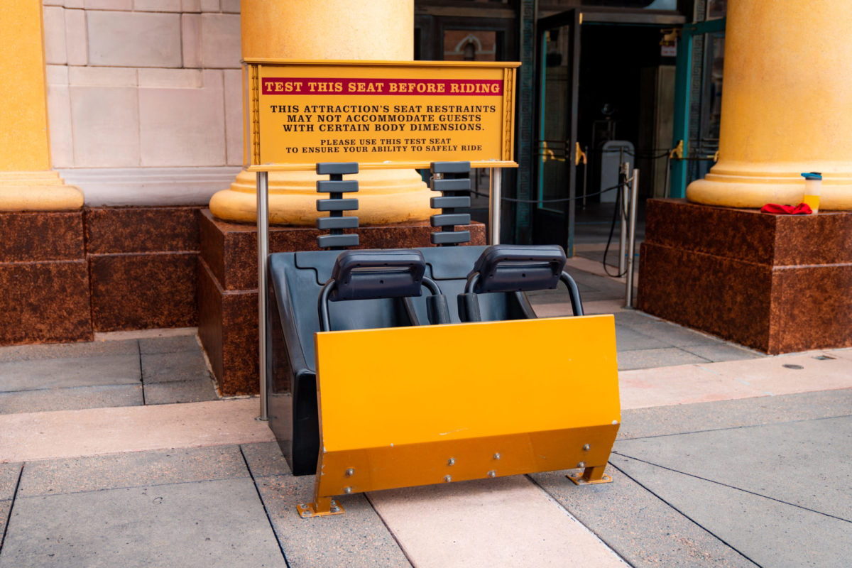
Test seat for revenge of the mummy at Universal Studios Is restrictive and very public.
“Revenge of the Mummy: Excruciatingly Public Test Seat, the true psychological thrill ride. http://dcipjoe.blogspot.com/2011/02/universal-studios-orlando.html

Actually, lets talk about tester seats: a wet bandaid of a solution if there ever was one. Is this supposed to be a compassionate alternative? Congratulations, you’ve moved one of the most potentially humiliating scenarios an American can experience in modern public life from the loading area, where dozens of people can witness it, to right in front of the bloody attraction marquee, where they can experience what it’s like to be a severed head on a pike. “Fat people beware.” Every attraction has a published minimum height requirement right in the park guide map, right in the description. Did we lose the measuring tape when it came to waist circumference? Did we run out of private alcoves to put tester seats in? How is this the world we live in? The rides we build dont even fit the people designing them! The twilight zone should stay inside the Tower of Terror.

And this isn’t only about emotional trauma and feelings – for those that need something more than human suffering to motivate them to pursue change – it’s a physical safety issue. The existence of fat people is ignored, forgotten, or otherwise overlooked in the design of attractions. The Punga Racers waterslide at Volcano Bay has notoriously injured over 100 people and PARALYZED James Bowen because it wasn’t designed properly to accommodate larger guests. Universal was forced to implement a 150 pound weight limit. 150 pounds. Guess what? That means its inaccessible to 63% of women, and 88% of men! Sounds like inclusion to me.

By the way, Mr. Bowen: he was 215 pounds. Even if the ride was designed to accomodate him safely, it would still exclude 30% of all men and 16% of women.

In 2013 a woman was killed on a roller coaster at Six Flags Over Texas because the restraints weren’t designed to accommodate her. The same thing happened earlier in 2004 in Massachusetts. How many people have to die, be maimed, seriously injured, or laden with a lifetime of mental illness before we invent a solution to accommodate fat people that isn’t “shove harder”?

I’m disgusted by the attitude this industry takes toward accommodations – as if they’re an annoying requirement imposed upon it, something that can be ignored or brushed off, as if the guests these decisions affect don’t really exist or aren’t that numerous. But we’re talking about, at the absolute very least, 30 million people in the US alone. And this lackadaisical attitude towards accessibility affects way more than fat people…unaccommodating restraints and vehicles are no friend to those in wheelchairs, those with mobility issues in general, amputees, etc, either. 

So what can be done? Well at the very least communication around issues of accessibility needs to be drastically improved. It shouldn’t be incumbent upon the guest to miraculously know if they might have an issue, or go on the worlds worst treasure hunt to find a hidden pdf somewhere on a park website to find out all the ways they don’t fit. Put it in the map, put it in the attraction description. Treat size and other accessibility issues the same way you treat height requirements: spelled out clearly. Make it simple. Don’t be afraid to list weight numbers if there’s an ACTUAL weight requirement, but don’t use weight in place of measurements. If the restraint only accommodates someone with a 40 inch waist, just say that. Waist, hip, and chest measurements would be a good place to start. Most people already know theirs. Hell create an online size chart like clothing manufactures do. 

Include chairs without armrests in restaurants and theaters. Embrace bench seats. Talk to actual fat people. Put the damn tester seat in a place where the entire land isn’t an audience!

These should be the obvious things, but harder work needs to be done in the long term. Designers and engineers and business leaders need to stop pretending that every person is the dimensions of a standardized test dummy or reference illustration. Accessibility needs to be a priority, not just for fat people, but for everyone. It shouldn’t just be shrugged off with an “oh it’s just not possible.” Really? This industry makes the impossible possible every day. It’s the entire business model: go faster, higher, more spectacular, more impossible than ever before. Embrace the freakin’ challenge. 

Hell, for the completely soulless capitalists among you, imagine the increased merchandise sales you’d have if all the t-shirts came in plus size and you suddenly trippled your market of potential customers. Imagine how many more “I survived ____” t-shirts you’d sell if those people actually were able to ride “____”. Imagine the increased attendance, increased good-will, increased number of visits per guests, increased guest-spend per guest if those 30+ million Americans actually felt welcome. 

For those of you feeling angry or exasperated with me, welcome to experience design. You are right now experiencing a small fraction of what it feels like to actually visit a park as a fat person. Will your restraint hold you? Remain seated please; permanecer sentados por favor.

  I shouldn’t have to argue that more guests should feel welcome because its better for the bottom line. I shouldn’t feel the need to write a 2000 word essay that’ll probably get me placed on a list somewhere to argue that fat people are, surprisingly, also people that deserve the same experiences their thin counterparts get for the same priced ticket. I shouldn’t have issues fitting on rides built in the last few years when I have no problem fitting on rides built in the 1950s. I shouldn’t have to argue that emotionally traumatizing 12 year old girls for life is maybe a bad thing that we shouldn’t contribute to. And yet here we are. 

This is an industry built on big dreams. Dream bigger.

The Four Elements of Themed Experiences and 5 Act Structure

This might not be my most eloquently prosed post, the final stretch of grad school is upon me and time is at a premium, but I have thoughts I want to share.

So I’ve been doing a lot of thinking into how to develop impactful and fun stories and attractions and I’ve think I’ve narrowed it down to 4 elements, from which the entire experience evolves. 

The first two are often talked about by Joe Rohde. First you have,

  • Theme: the moral of the story or message of the storyteller.
  • Subject: the “actors” that illustrate the story. Not only characters, but also place. 

Then there’s two more I’d like to add. 

  • Experience: this is the core event you will witness or participate in. Only a few words. Think archetypes.  This is similar to the aspirational quality that some theme park designers have talked about, but more importantly it is the lens through which the entire story will be framed.
  • Journey: the way we get there or specific premise. Think of it almost like a writing prompt. (Note: I debate whether journey belongs here because it’s somewhat determined by the other three)

You put the four together and the beginning of an attraction story begins to take place. 

For example in Rise of the Resistance we can see that 

  1. Theme: Good Vs. Evil. Evil will lose. 
  2. Subject: Star Wars. Intergalactic Civilizations. Spaceships.
  3. Experience: Prison Break
  4. Journey: Recruited into a space army and captured. 

Or The Haunted Mansion

  1. Theme: Death is actually kinda funny.
  2. Subject: A Haunted Mansion
  3. Experience: Guided Tour
  4. Journey: Deciding to visit that old creepy mansion

Of course there’s room for interpretation but with these four events you begin to see how any satisfying ride might be crafted. Even at random. Say you have. 

  1. Theme: Be careful what you wish for
  2. Subject: Construction Equipment
  3. Experience: Flight
  4. Journey: stumble into an abandoned construction site at night. 

One can start easily piecing together an attraction from this. Bob the Builder is tired of construction and wishes to do something more glamorous. We stumble upon him in a construction site right as he makes a wish for more excitement – causing the construction equipment to come alive. But it quickly grows dark as the construction equipment doesn’t like being unappreciated and chases us into the night sky on a whirlwind journey. Eventually it all comes to an end and Bob and us both realize that life is plenty exciting as is. 

Where this framework gets really exciting is how it ties into narrative 5 act structure. You have your four pieces of framework. Now what? Well let’s look now at classic five act structure. You’ll remember it from English class. I’m no expert, but here’s my summary

  • Act 1: Exposition: the world is introduced
  • Act 2: Rising Action: the main character sets out on a journey
  • Act 3: Arrival: the character achieves their initial goal. But at the midpoint of this act something happens which changes the equation and sets them on a new journey
  • Act 4: Journey Home: character sets off on the final quest. The final confrontation occurs at the transition to act 5
  • Act 5: Resolution and Denouement

The key thing to remember is that each key moment in the story occurs at an act transition, with the third act split in two – the key reversal occurring there. (All of what I’m about to say could be mapped onto 3 act structure too, but I think 5 makes it easier to talk about). 

So anyway…you’re building a ride. What goes where? Well I’d propose that nearly all attractions follow a simple rule. The Journey is everything that happens before the midpoint and the Core Experience is nearly everything that comes after. The theme and subject are what color each scene within and determine the ultimate outcome.

In modern attraction design it looks something like

  • Act 1: Entrance and early queue. The setting and world are introduced.
  • Act 2: Queue: the queue takes us on a journey into the world on our way to a promised experience (not always the core experience, but often). We learn about the world, and it’s rules, and why we’re there.
  • Act 3 Part One: Preshow: We arrive at the promised destination and new information is revealed that will set us on a new quest.
  • Act 3 Part Two: Load/secondary queue: The core experience (which follows its own three act structure) begins
  • Act 4: The Ride: We live out the meat of the core experience which leads us to one final climatic moment. 
  • Act 5: Climax & Exit: We experience the climatic moment of the core experience, and the story quickly resolves itself as we exit the vehicle with a denouement then or shortly thereafter. 

For example Indiana Jones and the temple of the forbidden eye:

  • Act 1: We come across an archeological dig at a temple
  • Act 2: We venture into the temple to see what’s up and learn this is a creepy place.
  • Act 3 Part 1 : we come across Sala and he tells us about quest expeditions we’ve somehow signed up for and the legend of the forbidden eye. Also we need to find Indy.
  • Act 3 Part 2: we decide to go on our own expedition (the core experience begins)
  • Act 4: The expedition throws up many obstacles of increasing threat level, preventing us from rescuing Indy until
  • Act 5: We nearly get crushed by a Boulder and narrowly escape. Indy lectures us since we were the ones that needed rescuing and we slowly make our way out of the scary temple. 

Or Rise of the Resistance

  • Act 1: We find the rebel base
  • Act 2. We are tasked with a mission to space but something goes wrong
  • Act 3 Part 1: We’re captured and thrown in prison
  • Act 3 Part 2: We’re rescued and begin our prison break (core experience)
  • Act 4: We journey through the prison facing increasing obstacles trying to make our way home until
  • Act 5: a final climatic encounter and daring escape pod run. We’re told we did a good job and exit.

As long as queues are long, and rides are short I predict this is the specific way we’ll see the structure implemented. What’s interesting though is looking to the past to see how rides and attractions then still followed the same structure BUT implemented it differently.

For example, before queues were really designed as part of the experience, it was common for the ride to begin as early as the beginning of Act 2. Let’s reference Pirates of the Caribbean (California version)

  • Act 1: We are introduced to New Orleans square and the Blue Bayou.
  • Act 2: We begin a journey through the bayou and enter mysterious caves
  • Act 3 Part 1: We learn that pirates used to inhabit these caves
  • Act 3 Part 2: The pirates materialize and the core experience of seeing pirates do pirate things begins
  • Act 4: Pirates do pirate things until
  • Act 5: The town climatically burns down, they all drunkenly kill themselves, and we exit this fever dream and end up back where we started.

Now consider how Pirates was adapted when it moved to Florida and it adopted the new-fangled immersive queue. The immersive queue replaced The Journey portion of the ride leaving only the Core Experience. The overall structure of the story was preserved, but what specific elements achieved it changed.

There’s even a ride that has a more unusual implementation. Let’s look at The Living Seas. For starters

  1. Theme: The ocean is majestic and cool
  2. Subject: Seabase Alpha
  3. Core Experience: Explore an Alien World (And/or aquarium)
  4. Journey: Specialized technology takes us deep under the sea

Now:

  • Act 1: We’re introduced to the history of sea exploration in a museum and documentary
  • Act 2: We begin our journey under the sea via Hydrolator
  • Act 3 Part 1: We take sea cabs to further our journey
  • Act 3 Part 2: We arrive at Seabase Alpha
  • Act 4: We explore Seabase Alpha (core experience)
  • Act 5: We leave Seabase Alpha via Hydrolator

This is the only attraction I’m aware of that has used the ride as a journey rather than the core experience. It’s an unusual implementation but it just goes to show that any means can be used to achieve any part of the structure, as long as all parts of the structure are there, you get yourself a satisfying experience.

The more I think on it, the more I think nearly all attractions can be conceptualized in this framework, and better yet this framework provides a nice blueprint to develop new attractions. Does it apply to your favorite?

Ready when you are CB: A Primer on Editing Technique for Themed Entertainment

At first glance it may not seem like there is that much in common between film editing and theme park design – but it turns out there’s a lot in common.

Welcome aboard! My name is Kira, and I’ll be your guide here on this great movie diatribe. It’s the perfect job for me because I used to work in movies! But just between you and me this is no ordinary tour. Because here we’ll be taking a look a film editing techniques and seeing how they can be used to design theme parks and rides! Funky huh? Just please make sure to keep your hands, arms, and eyes in an ergonomic positions at all times.

Now that we’ve taken care of business. Let’s talk about me. Back before I started pursuing a career in themed entertainment design, I had another career ambition. For a very long time I wanted to be a film editor. (Yes ironic for a person who can’t cut anything out of a 7000 word article). I fell in love with the process of editing when I was a young teenager, went to film school, and had a fairly successful career working in all stages of the post production process – editing quite a number of short films, commercials, and a feature along the way. As such, I spent a lot of time studying editing theory and how, not to craft stories from scratch, but how to tell stories with existing pieces: spending a lot of time thinking about how to shape emotion through the use of pacing, perspective, music, etc. And as such I can’t help but approach the design of themed entertainment from within this framework. But it’s occurred to me that this might be a more novel perspective for many people interested in the discipline because while modern theme park design has its roots heavily planted in movie making – most current fans and people interested in designing it tend to have roots more in visual art, writing, technology, or general theme park fandom. 

And I know what you’re thinking. “Editing? How is there any editing happening in a theme park? It’s all just one continuous environment!” To which I’d reply, “Well, only sort of.” The rules and theories behind editing actually apply to any sort of art form that’s experienced over a period of time. Editing is the study of how to best tell a story. And when you look at themed attractions in particular, there’s actually a lot of tools being used in ways remarkably similar to cutting together film. So what do you say? Is everybody ready?

Continue reading “Ready when you are CB: A Primer on Editing Technique for Themed Entertainment”

Theme Park Musing #9 – The Carousel of Progress

When you think about it, there has to be something really sophisticated about the storytelling structure of The Carousel of Progress. Not many stories have a recurring cast of characters that essentially relive the same scene over and over again while experiencing no character growth, no real conflict, no real plot, and yet somehow lead to a satisfying conclusion. In fact the point of the “plot” of each scene – if you can even call it a plot – is that everything is perfect, there are no unsolvable problems, and life is pretty great. But, I think, that understanding how this attraction tells it story is actually key to understanding how many attractions, many of the best attractions – especially of the 60s, 70s, and 80s tell their stories. 

The carousel of progress is a great example of story that tells itself almost entirely with subtext and an awareness of the context that its audience lives in a different time period than the one depicted. The story depends on a permanent, though subtle, break in the fourth wall. Even though we don’t play much of a roll in the events depicted, we are none the less characters in the story that the other characters (well character – father) acknowledge. We actually play a fairly major roll – because even though it’s not made explicit with an elaborate justification or plot, and instead through a very presentational formalism, we are essentially playing time travelers visiting the same kind of family in 4 different eras and this is when you can start to break down how the story actually functions.

And it functions because the main characters of the story aren’t actually the humans we see, but actually ourselves and, more importantly – the setting. I’d argue that the setting is actually the protagonist of the show. Which is a kind of weird thing to consider but it is the thing which experiences change and growth over the course of the plot. 

Traditional stories happen by seeing a main character, the protagonist, go through some sort of change or growth over time. And some fancy stories, say beauty and the beast (someone else pointed this out to me but I don’t remember who) separate the main character and protagonist. Belle is the main character, but she is arguably not the protagonist. She’s pretty much perfect in the beginning and perfect in the end. The story is of Beast – he’s the one that grows and develops over the course of the story. He’s the one with the flaw who eventually overcomes that flaw. 

And then we get to theme parks, and the carousel of progress – where a new structure emerges. But it’s actually pretty similar to the beauty and the beast scenario above. 

Enter us. We are the main characters, it’s our POV that shapes the story we see. But alas we’re not the protagonists. For the purposes of the story – we’re perfect. We don’t really need to change. We’re here to observe the change, perhaps facilitate the change. The SETTING is the protagonist. It is flawed, it needs to change. 

And by setting I’m not referring to just the set. The setting is the entire world of the scene of the story. And a 2019 coffee shop is not just demarked as a 2019 coffee shop by the presence of a chalkboard menu and cold brew espresso machine. But also by the numerous laptop toting hipsters waxing Abraham Lincoln beards, the woman in the corner unjamming her manual typewriter, and the guy who just arrived on a unicycle. These characters are part of the setting, and their micro stories make it come alive. 

And so we get to the carousel of progress. The first scene we see is a white bread American family circa 1900. Remember the setting itself is the character. And over the course of five minutes it says to us (also characters) “hey isn’t this great! Everything is perfect.” And we say back (in our heads) – “yeah not really, haha you’re so quaint”. From our point of view, the setting is flawed. The technology is old and antiquainted and the people are happy with it. They haven’t seen the light! And so we move on and the setting moves on, and changes, tries to impress us, and the cycle repeats until we reach a point where the setting (at least when the attraction debuted) can say “wow look how great I am” and we can respond back “yeah actually you’re right! You’ve met and surpassed my expectations” Hell in this way, the audience is in fact the source of the conflict and I daresay a kind of antagonist – in the sense that an antagonist is the motivation for change. 

And this conflict, this relationship, between the setting (as a character) and us helps us too. Just as Belle might have learned some new things about life along the way of her journey so have we. When we initially saw the setting – we laughed and said “oh how quaint”. But as the setting grows and develops over time and we see patterns repeat – we start to notice those patterns in ourselves and our own lives. The theme of the continual march of progress, and how we don’t even know what wonders await us, manifests itself in us as the pattern in the character becomes obvious. 

This is how The Carousel of Progress works, and, I think, many other traditional attractions. How the original designers of that age were able to do something so sophisticated, tell a type of story that is so rare – but so full of potential, and do it basically intuitively – damn I don’t think I’ll ever know that. But, in terms of what’s actually happening, by god I think I actually GET it now. 

And shout-out to @pureimagineering because his theory of triple perspective storytelling very much helps inform this.