Jolly Holiday – Cherry Tree Lane Build Progress

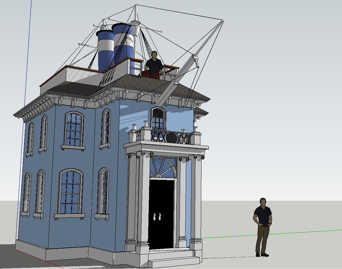
A goal I have had for a while is to concept model most of the Jolly Holiday attraction, especially the queue. Considering I basically have no 3d modeling experience, this should be quite the adventure. That’s sort of the intent really – to use it as an exercise in learning modeling. And today I have reached the first goalpost on that journey having, I think, finished the first big set piece of the queue. 

This is the house of Admiral Boom and functions as one of the main focal points of the queue. I’m pretty happy with how it’s turned out and especially once the rest of everything is build it’ll be exactly what it needs to be. I’m also quite happy I was able to work in some forced perspective while I was building it. As always I love feedback.

I probably won’t post too many updates on this project, as I think it’ll function as incentive for me to complete it all so I can share the final product in one big go, so if this website becomes quieter than it already is – that’s likely why. Thanks for reading as always,

Pandora: The World of Avatar Review

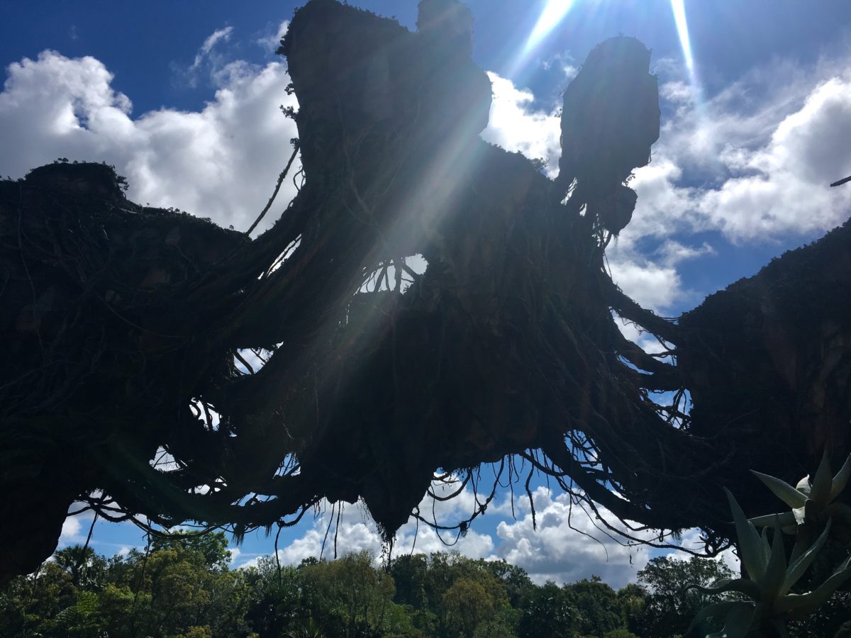
One of the great benefits about the intersection between having a summer birthday, being an only child, and belonging to a family that lives in Orlando is there’s always ample reason to come down and visit the brand new attractions that open every summer. And that’s how I got to experience Pandora this past weekend.

Where to begin. As about a million bloggers have already stated, the land is fantastic. It’s detailed, beautiful, and pretty much defines what a modern immersive environment should be. It’s flaws are relatively minor and easily overlooked. My only regret of visiting was that I didn’t have more time to more fully absorb it and experience it at night.  I’m going to break the land down into its individual parts and address each. So let’s get started.  Continue reading “Pandora: The World of Avatar Review”

On theme and the future

Before today’s Presentation gets underway I just want to throw out some thoughts about Epcot.

Future World was never about the future or technology or science fiction but about Humanity, our interactions with each other and the world, and the history and future history of ourselves.

World showcase was never just about being a world tour of architecture and food. It was about Humanity and our cultures – a giant expansion of the premise in It’s a Small World, outlining a hope for respect, celebration, and curiosity regarding our differences.

The reason the combination of what had been designed as two separate parks worked so well is that together the two halves functioned as a singular thesis detailing the history of ourselves and where we hoped to go.

Joe Rohde has a quote about theme parks fundamentally needing to have a theme in the literary sense – a moral or idea to explore that’s at the center of all the experiences. And I think much of what we’ve seen in the theme park world in recent years, specifically Disney has been a loss or modification of that principle – whether it’s because Disney has lost sight of it or because we’re in a huge period of transition remains to be seen. I honestly think this is what made most Disney parks unique from other parks even if the company didn’t realize they were doing it.

The magic kingdom/Disneyland is about childhood and the shared myths of a country that has influenced much of the dreams of the world. Epcot was about Humanity and our interactions with each other and place in it. Animal Kingdom is about Nature and Humans relationship with it. These deep themes give the parks resonance. It’s revealing that the one park in Florida that only had a subject (movies) but no real theme, is the park that has suffered the most over the years.

The parks in Florida by all accounts have been and are heading into one of the biggest periods of change in the resort’s history, and the parks worldwide and industry have been seeing large shifts in the business model, what attractions consist of, etc. I’m not inherently opposed to change. Change is often difficult, especially when it involves the destruction of something you have fond memories of, but it can also be exciting and an opportunity. There is a trend amongst Disney fans on the internet that become aghast at almost any change and that’s not what this essay is about. As long as theme parks are viewed primarily as entertainment and not art by the public, and as long as their business model relies on people coming back, parks will always have to keep themselves fresh, deliver new experiences, and change to accommodate culture. And frankly the most interesting parks are the ones that have been around the longest and seen these changes mold their landscape over time – a completely artificial reality somehow becoming just as rich of a place as any other.

My only concern is that in this particular period of change there does seem to be the potential for that guiding principle of theme in that literary sense to be forgotten. Change in theme would be hard but forgivable and maybe even beneficial in the long term but a loss of theme results in a fundamentally different experience – a day long experience where all experiences inform each other becomes a day long hodge-podge of corporate branding and it is literally only the presence of that underlying theme, story, whatever you want to call it, that prevents that from happening.

I really am excited about the upcoming announcements and am largely confident about the future of the parks around the world. The beauty of time and history is that even when a pendulum swings too far it tends to swing back. But nevertheless these worries do run in my mind. I worry about the public perception of the company and how that ripples across generations. I worry about how certain trends in themed entertainment design create dogma that excludes other types of experiences from being created – experiences or styles that used to be central to the medium and still have utility. And I worry about the park naive enough to theme itself to all of Humanity and by so doing became a park with the most potential to do something meaningful with the tools of themed entertainment besides just entertain – that it might decide to abandon that potential in favor of an easier end.

The movies we enjoy most are those that tell us something about ourselves – that do more than than just offer fuzzy, funny characters and action sequences. If you can deliver the fuzzy, funny, the frenetic AND the deep meaning, or theme, then you have the worldwide hit. And Disney gets this. They churn out movies with that formula all the time. Here’s hoping they use it again.

Fox Hunt

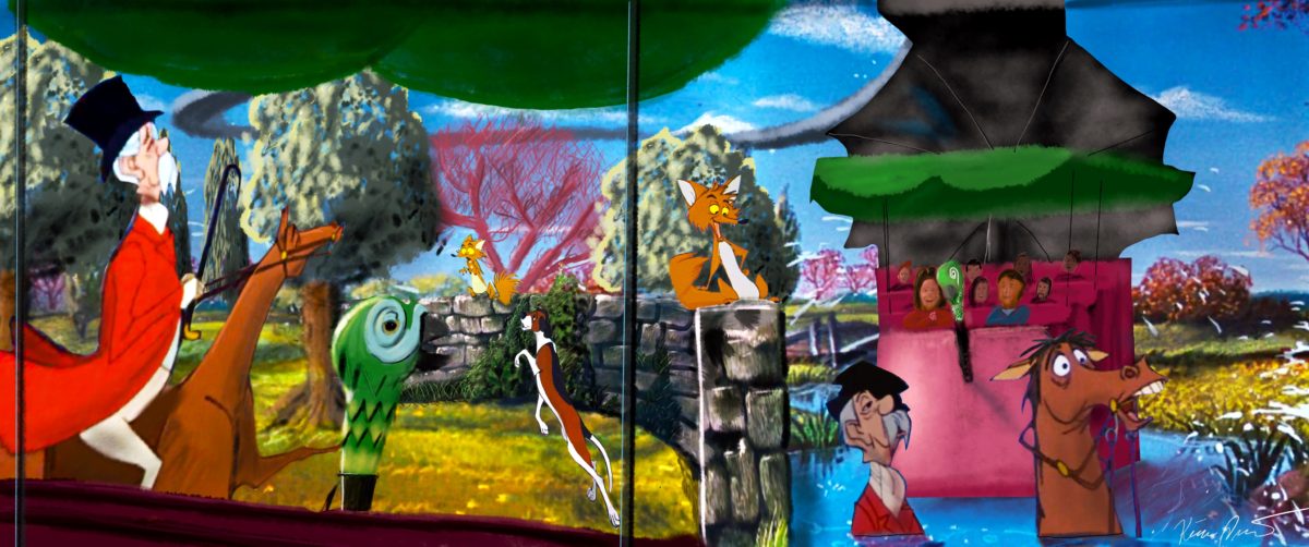
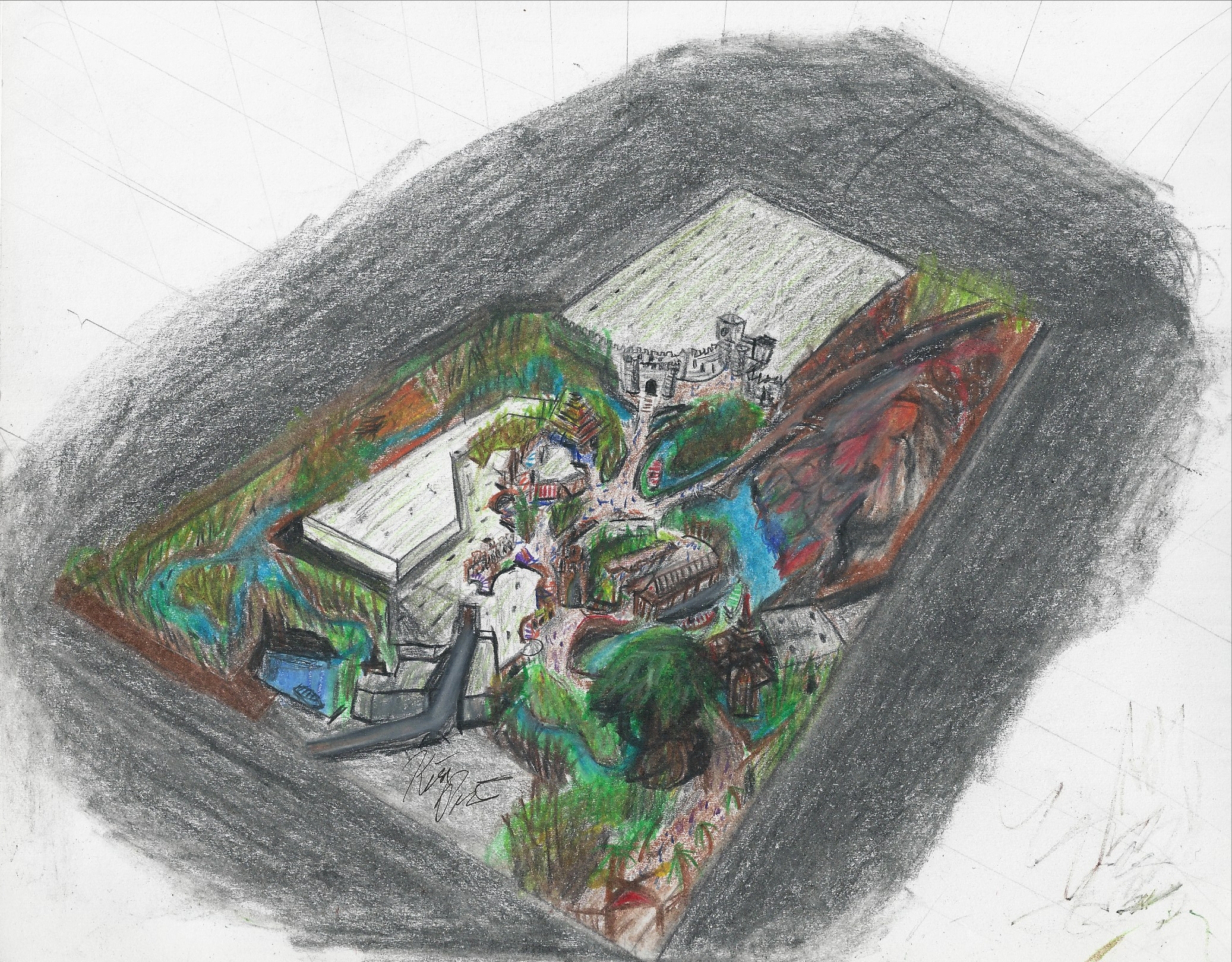
This scene occurs right before the climatic projection tunnel horse race sequence. The animatronic fox “walks/runs” along the wall and then ducks behind it as the animatronic hunter and dog come along from either side and follow you around as you disorient the rider and he ends up in the pond. The interesting thing in this scene is that I think it would be cool for it all to happen in the same room – and also efficient to save on animatronics. So that’s how its rendered here. Though I’m not positive the timing would work – would have to study it further. Anyway, I’m really happy with how this image turned out.


Supercalifragilisticexpialidocious!

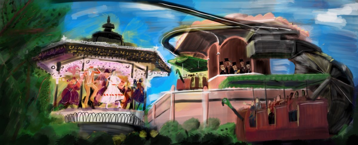
Today, another update for the Jolly Holiday ride. Continuing to work on my digital painting skills, here’s an image of the penultimate scene of the ride. This is the first time I’ve tried modeling a scene in 3D and then painting over it – which I really enjoyed doing as a way to easily test composition. Also one of the first attempts I’ve done at doing a more painterly style and method, avoiding lifework and trying to build an image entirely with tone and color. I really like the idea of this method of working, but it’s gonna take a while to nail down. Hope you like, and as always feedback is greatly appreciated. For everything about this ongoing project you can check out the Jolly Holiday Page

Fantasy Fantasyland

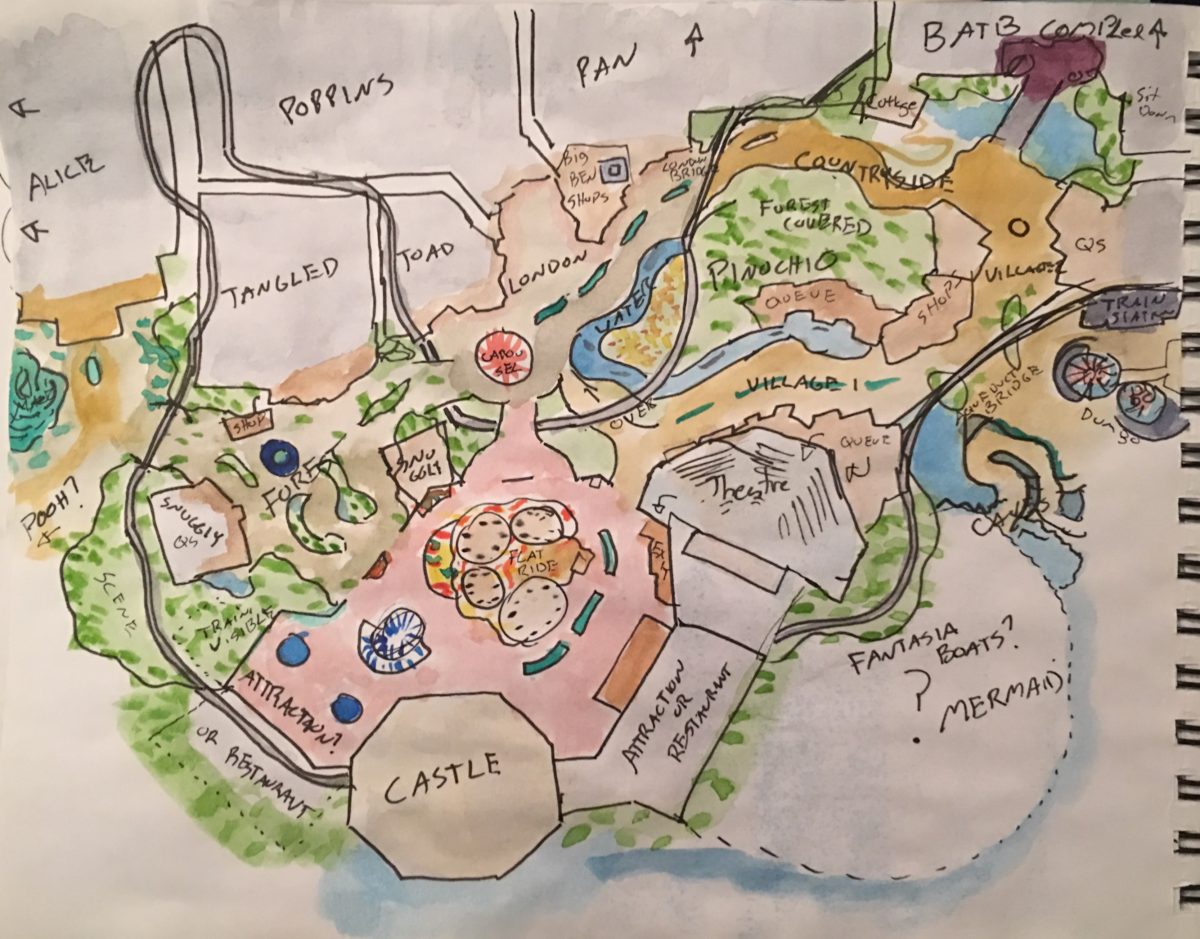
I was working with a bunch of people on a fan-made Fantasyland on a Disney fan site and made up this overview and layout based on some of the ideas discussed. I can’t take complete credit for the ideas here, many people discussed them, but the layout is mostly mine and I’m really fond of it – hence my posting. 

Just a quick rundown of the image. The center of fantasyland starts of fun in the castle courtyard which is home to a flat ride or two and possibly a restaurant, some gift shops, the exit to the theater. The courtyard is elevated compared to the rest of the land. From there bridges extend out into the rest of the land – split into the Forest, London, and the countryside sort of mini-lands. Casey Jr train – a sort of WedWay runs throughout the land going above and below grade and running through most of the show buildings encountering glimpses of other rides and exclusive scenes from properties not otherwise featured in the land. 

Anyway that’s the super quick rundown, most of the rest is self explanatory. The project itself has evolved from there but I really liked this layout and selection of attractions. What do you thjnk?

Adventureland – New Aerial View

If you’ve browsed this site at all you may have come across my Adventureland side project. And you also might be aware that I’ve been self-teaching myself art (and also a bit of 3d modeling) for the last year and a half or so. In fact, the first piece of concept art I ever tried to make I drew just a little over a year ago and it was of this Adventureland.

Adventureland Overview 1

I think I’ve come quite a ways since then and made a lot of progress.
It’s easy to lose sight of overall progress when focused on the day to day and week to week work. And I continue to try to improve those skills and acquire new ones. In that vein, (and in part due to a recently acquired iPad Pro), I’ve been slowly approaching the world of digital art. Talk about needing to learn a lot. Eeesh. I’m particularly interested in digital painting, and using a more painterly style because that process of going from vague shapes to more and more refined detail appeals to me a lot as that’s generally how I already think  – linework I find to be agonizing and hindering. Plus it just looks cool. So it’s been something I’ve been wanting to add to my repertoire in addition to digital skills in general.

Anyway this is long-winded way of saying that I recently attempted to redo this piece of art digitally and in that painterly style – no linework. It took a lot longer than I thought it would, the results aren’t perfect, and there’s a lot I found myself struggling to figure out how to figure out. But I also like it. So here it is, the new aerial rendering of my Adventureland.

Adventureland Overview 1 Digital

So what do you think? As always I love feedback. And for more details about the land itself be sure to check out the project page here.

That’s all. Thanks for reading.


Jolly Holiday – The Penguin Cafe

Not much to say this time – just here’s a new piece I did visualizing the penguin scene of the ride. The vehicle moves around the island in a circle while really great animatronic penguins dance away (and maybe jump through the canopy of the ride vehicle!). 

As always I love feedback and hope you enjoy! For everything Jolly Holiday check out the project page

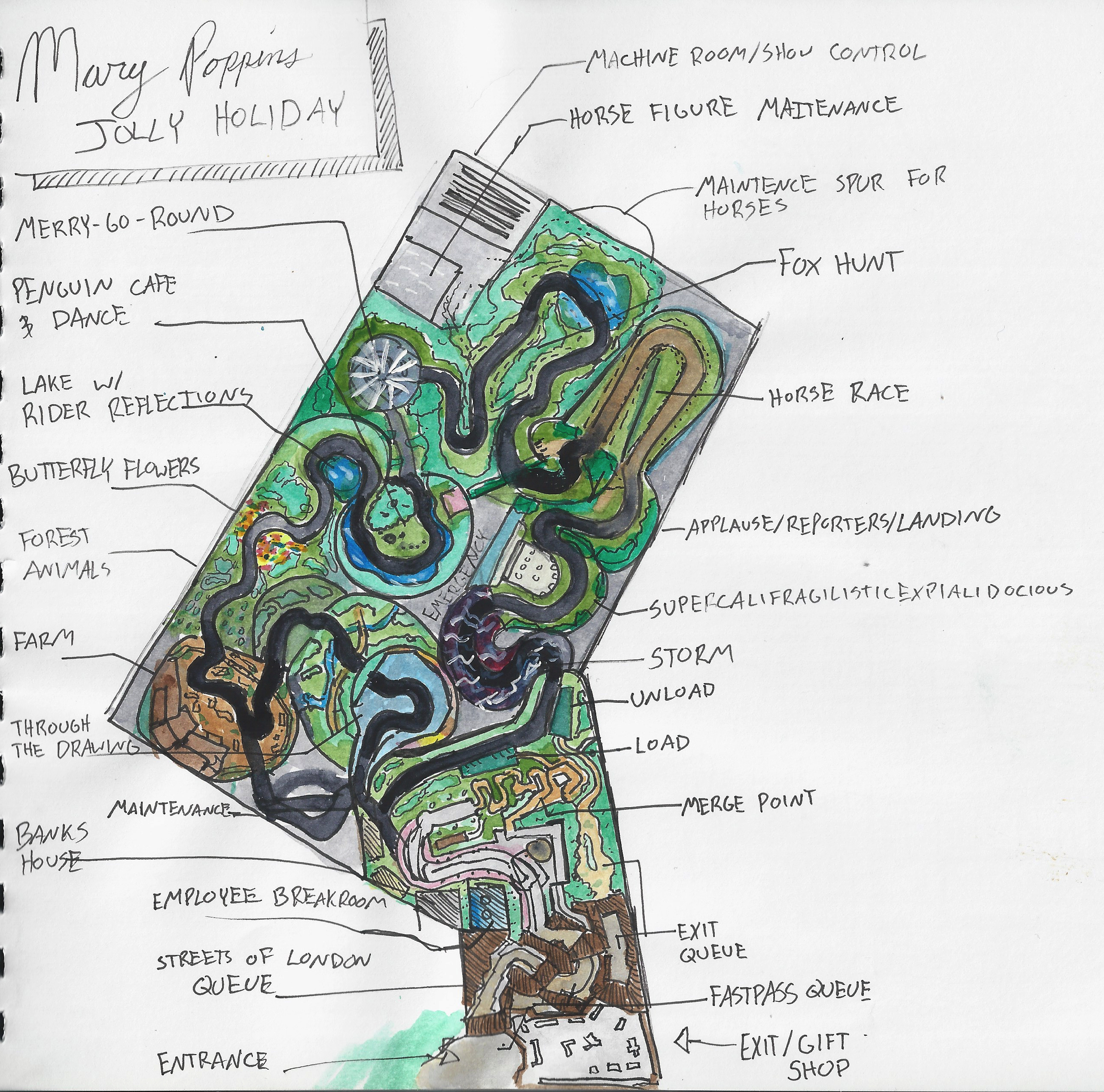
Jolly Holiday – New Site Plan

Happy New Year! (Again, I think – I need to log on to this site more). Today I come with a new, more detailed site plan for Jolly Holiday. This is probably the closest I’ve gotten to something that could actually be built, and also stays relatively compact. I’m really happy with it. The only thing I would change is that currently there are two maintenance areas – one for vehicles, and one for the horses – and I think there’s enough room that they could just be combined into one.

MP_Site_Plan

While I’d be happy to see it anywhere, the design has always been geared towards Epcot and the UK pavilion – so as I’ve refined it I’ve definitely kept that in mind. As you can see it fits very nicely there (obviously getting rid of Millenium village is necessary )and leaves plenty of room next door for a new pavilion.

MP_Site_Plan_Map

So what do you think? Love feedback as always.

In Praise of Traditionalism

dsc_0125
Disneyland’s Pirates of the Caribbean is probably the pinnacle of traditional design.

Okay, since I constantly seem to get sidetracked by this issue any time I try to write anything about theme parks, I might as well talk about it now.

First some quick definitions. David Younger in his fantastic book aptly titled “Theme Park Design” (add link) outlines a few different design styles that have been applied to theme parks in their relatively short history. Here they are along with their (paraphrased) definitions.

Traditional: the classic form of design that originated with Disneyland that seeks to immerse you in environments. Characteristics include almagations of different kinds of spatial entertainment (not just rides), a trend towards experiential vs explicit story, loose theming. Pirates of the Caribbean or The Haunted Mansion.

Continue reading “In Praise of Traditionalism”