Ready when you are CB: A Primer on Editing Technique for Themed Entertainment

At first glance it may not seem like there is that much in common between film editing and theme park design – but it turns out there’s a lot in common.

Welcome aboard! My name is Kira, and I’ll be your guide here on this great movie diatribe. It’s the perfect job for me because I used to work in movies! But just between you and me this is no ordinary tour. Because here we’ll be taking a look a film editing techniques and seeing how they can be used to design theme parks and rides! Funky huh? Just please make sure to keep your hands, arms, and eyes in an ergonomic positions at all times.

Now that we’ve taken care of business. Let’s talk about me. Back before I started pursuing a career in themed entertainment design, I had another career ambition. For a very long time I wanted to be a film editor. (Yes ironic for a person who can’t cut anything out of a 7000 word article). I fell in love with the process of editing when I was a young teenager, went to film school, and had a fairly successful career working in all stages of the post production process – editing quite a number of short films, commercials, and a feature along the way. As such, I spent a lot of time studying editing theory and how, not to craft stories from scratch, but how to tell stories with existing pieces: spending a lot of time thinking about how to shape emotion through the use of pacing, perspective, music, etc. And as such I can’t help but approach the design of themed entertainment from within this framework. But it’s occurred to me that this might be a more novel perspective for many people interested in the discipline because while modern theme park design has its roots heavily planted in movie making – most current fans and people interested in designing it tend to have roots more in visual art, writing, technology, or general theme park fandom. 

And I know what you’re thinking. “Editing? How is there any editing happening in a theme park? It’s all just one continuous environment!” To which I’d reply, “Well, only sort of.” The rules and theories behind editing actually apply to any sort of art form that’s experienced over a period of time. Editing is the study of how to best tell a story. And when you look at themed attractions in particular, there’s actually a lot of tools being used in ways remarkably similar to cutting together film. So what do you say? Is everybody ready?

Continue reading “Ready when you are CB: A Primer on Editing Technique for Themed Entertainment”
Why is Pirates so Good?

Theme park fans are an interesting bunch of people. We consist of everything from blue collar vacationers, hipster theatre auteurs, oh-so-serious designers, cosplaying character seekers, internet attached reporters, teenage thrill seekers, retired day-trippers, and every combination in between. And in this diverse group debates rage on pretty often  around themes of what themed entertainment should be, who it should target, and what its ambitions should be. Entertainment? Thrills? Inspiration? Escape? Community? Fun? It’s interesting that in a world that caters itself to so many different niches of preference, that one attraction comes up again and again as a shining example of common ambition. Seemingly almost everyone continually agrees that the original Pirates of the Caribbean at Disneyland is one of, if not the, best themed attractions ever built. So what makes Pirates so great? Why does it work so well? 

Well, of course no discussion about the excellence of Pirates would be complete without taking a moment to state an obvious reason; the ride is a showcase of technical and artistic perfection. The set and lighting design is wonderful and detailed, the sculpture worthy of galleries, the sound design multilayered, the building comfortably cool, and the acoustics better than even many attractions and theaters built today. Those features are foundational to creating any truly great entertainment experience. It’s tempting to say that that is the reason Pirates always stands out: the scale of the sets, and quantity of animatronics, duration of the ride, effectiveness of the effects, and the overall detail create an immersive environment that just really excels. And while all of that certainly plays a role, I think the idea that lavishness alone creates amazing attractions is a bit of a myopic conclusion: one that seems to be playing an increasing role in the design of new attractions and even more in their publicity. The idea that absurdly grand environments and obsessively detailed story are what make something immersive is true, but is also a limited understanding of the word ‘immersion’.

  See, ‘immersion’ has become somewhat of a buzzword in the popular lexicon – being used to describe everything from the upcoming Star Wars land and groundbreaking theatrical experiments to cell phones screens and restaurant menus. Even in the theme park world, the word can be overused and find generic meaning. Even when it is used to describe experiences that genuinely transport, this is often achieved narratively, architecturally, or with details, props, and backstory. And while there is no doubt that those techniques are crucial they also only get Pirates halfway to being the flagship that it is. So much more comes from the design of the attraction structure itself and the way it immerses the rider into those environments and story. Pirates chooses to immerse you viscerally and emotionally in the way the experience unfolds. It uses the physical space and the progression of that space to affect techniques of hypnosis and patterns of dreams to immerse experientially, not just thematically. And that focus on the experiential story of the audience itself is what makes all the difference.

Continue reading “Why is Pirates so Good?”

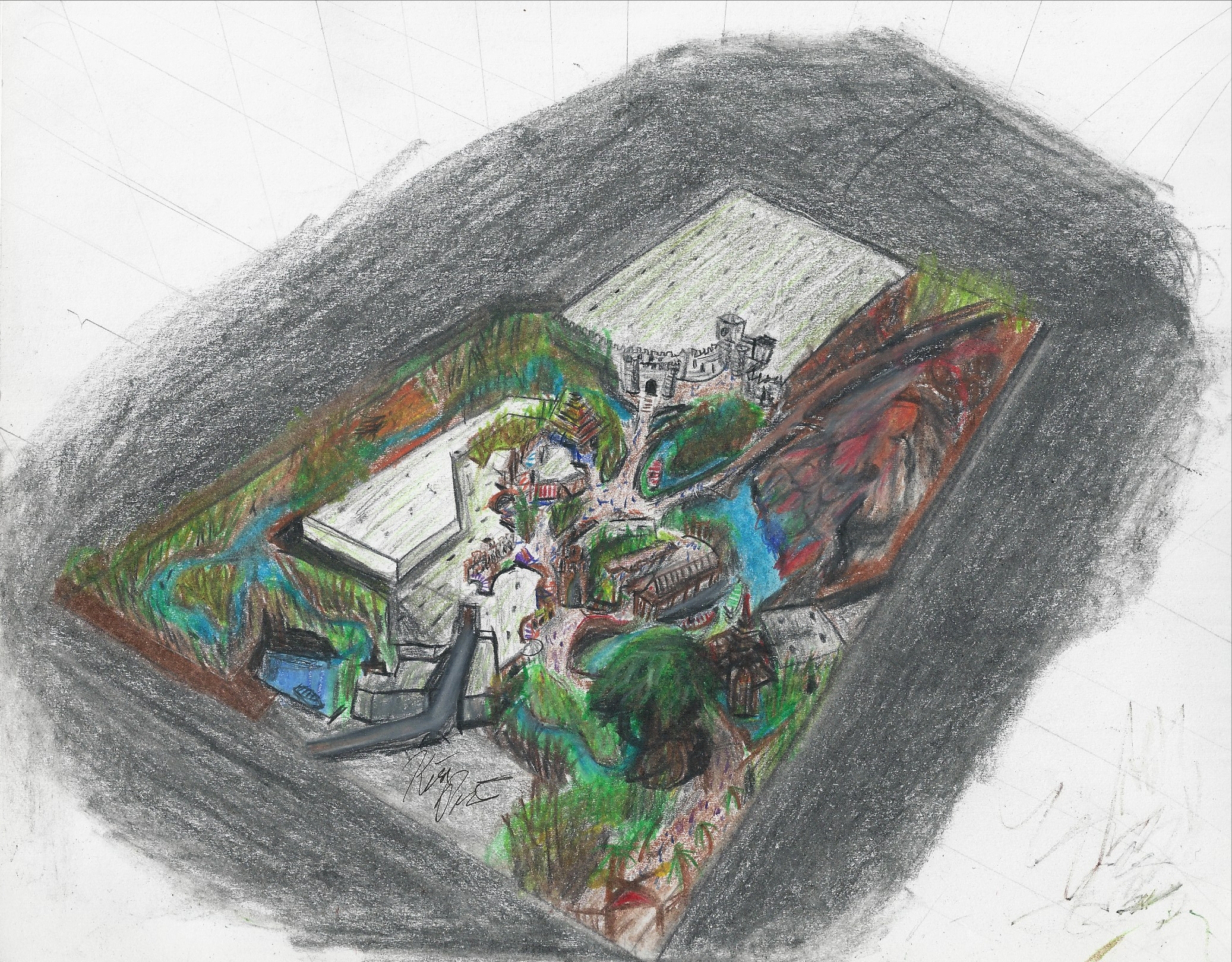
Adventureland – New Aerial View

If you’ve browsed this site at all you may have come across my Adventureland side project. And you also might be aware that I’ve been self-teaching myself art (and also a bit of 3d modeling) for the last year and a half or so. In fact, the first piece of concept art I ever tried to make I drew just a little over a year ago and it was of this Adventureland.

Adventureland Overview 1

I think I’ve come quite a ways since then and made a lot of progress.
It’s easy to lose sight of overall progress when focused on the day to day and week to week work. And I continue to try to improve those skills and acquire new ones. In that vein, (and in part due to a recently acquired iPad Pro), I’ve been slowly approaching the world of digital art. Talk about needing to learn a lot. Eeesh. I’m particularly interested in digital painting, and using a more painterly style because that process of going from vague shapes to more and more refined detail appeals to me a lot as that’s generally how I already think  – linework I find to be agonizing and hindering. Plus it just looks cool. So it’s been something I’ve been wanting to add to my repertoire in addition to digital skills in general.

Anyway this is long-winded way of saying that I recently attempted to redo this piece of art digitally and in that painterly style – no linework. It took a lot longer than I thought it would, the results aren’t perfect, and there’s a lot I found myself struggling to figure out how to figure out. But I also like it. So here it is, the new aerial rendering of my Adventureland.

Adventureland Overview 1 Digital

So what do you think? As always I love feedback. And for more details about the land itself be sure to check out the project page here.

That’s all. Thanks for reading.


In Praise of Traditionalism

dsc_0125
Disneyland’s Pirates of the Caribbean is probably the pinnacle of traditional design.

Okay, since I constantly seem to get sidetracked by this issue any time I try to write anything about theme parks, I might as well talk about it now.

First some quick definitions. David Younger in his fantastic book aptly titled “Theme Park Design” (add link) outlines a few different design styles that have been applied to theme parks in their relatively short history. Here they are along with their (paraphrased) definitions.

Traditional: the classic form of design that originated with Disneyland that seeks to immerse you in environments. Characteristics include almagations of different kinds of spatial entertainment (not just rides), a trend towards experiential vs explicit story, loose theming. Pirates of the Caribbean or The Haunted Mansion.

Continue reading “In Praise of Traditionalism”