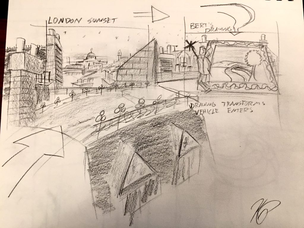
Been going back to basics recently, just working on drawing from imagination in pencil. Not much else to say other than that. As always Feedback is greatly appreciated.

Themed Entertainment from Kira Prince
Lot’s of people always seem interested in process, I certainly know I am, and I’m continually told that as an aspiring theme park designer it’s what people who are in the hiring (or grad school admissions) positions really want to see. And while that’s very much one of the purposes of this site, I think perhaps it’s useful to dive in deeper when I have opportunities to do it. And this is one of those cases. Continue reading “Fox Hunt – Process”
I was working with a bunch of people on a fan-made Fantasyland on a Disney fan site and made up this overview and layout based on some of the ideas discussed. I can’t take complete credit for the ideas here, many people discussed them, but the layout is mostly mine and I’m really fond of it – hence my posting.
Just a quick rundown of the image. The center of fantasyland starts of fun in the castle courtyard which is home to a flat ride or two and possibly a restaurant, some gift shops, the exit to the theater. The courtyard is elevated compared to the rest of the land. From there bridges extend out into the rest of the land – split into the Forest, London, and the countryside sort of mini-lands. Casey Jr train – a sort of WedWay runs throughout the land going above and below grade and running through most of the show buildings encountering glimpses of other rides and exclusive scenes from properties not otherwise featured in the land.
Anyway that’s the super quick rundown, most of the rest is self explanatory. The project itself has evolved from there but I really liked this layout and selection of attractions. What do you thjnk?
Hello again! Today a visit to 2nd tier of themed entertainment: Seaworld Orlando.
I actually really like Seaworld Orlando. Views on animals in captivity and recent controversies aside, the park itself is a really pleasant and attractive place to be with some fantastic coasters (if perhaps less than fantastic other rides). While I often say I grew up at Walt Disney World, since it was 15 minutes away from my house and both my parents worked there and we were therefore there very often, it’s actually probably more accurate to say I grew up at Seaworld. My house was within walking distance of the front gates (not that I ever actually have walked there – should try that some time), my family loved the place because of all the shows and as a nice place to walk, and we probably were there a good deal more than Disney- at least until I became a tad older and wanted to ride more rides. Keep in mind there were nearly no rides at Seaworld during this period – only the sky tower and Wild Arctic. Later there was Journey to Atlantis (which I have ridden a record 13 times in a row without disembarking) and Kraken (which was my first “big kid” roller coaster). But there was an amazing playground! (which the good part of doesn’t exist anymore). So lots of fond memories, lots of experience with walking around and seeing the sights, lots of sadness around the lack of water-skiing shows these days.
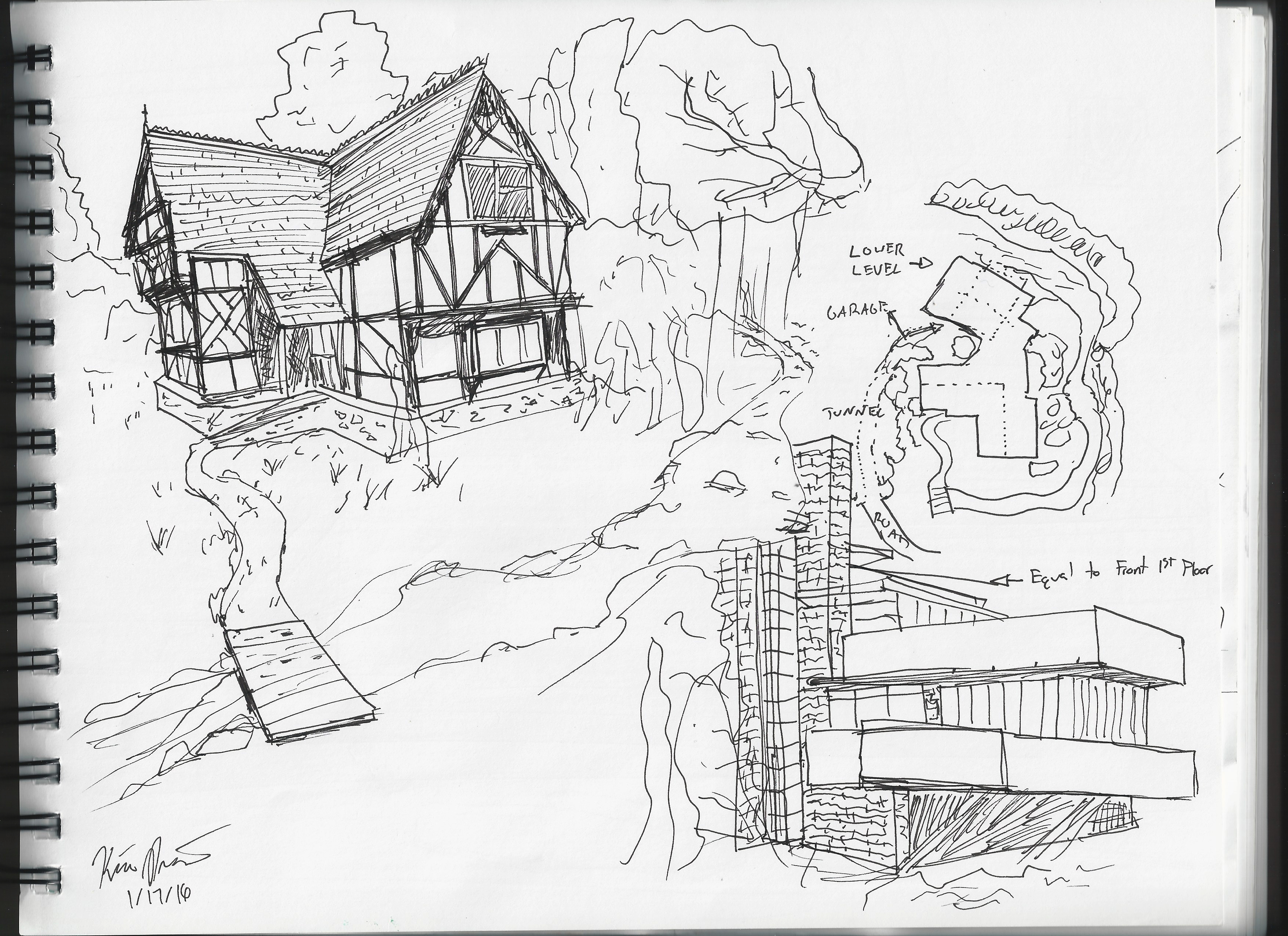
A slight departure from strict themed entertainment today. I was talking to one of my friends and we somehow got on the topic of dream houses. Ok, we were hiking in the mountains of LA that are chock full of beautiful houses and we might have been a tad envious. Anyway, I was trying to explain that I’ve always loved the idea of taking themed entertainment and applying it to my house. The idea of having a house where you have one building but depending on where you see it from looks like completely different buildings fills me with so much joy. I also like the idea of having one hidden side of the house looking like the most boring warehouse ever. Plus, there’s so many great styles of architecture and this lets you have more than one and rake in all the benefits of each. Some of my favorite styles are Tudor and Modern and so when I got home I looked up some examples and came up with a quick sketch of what I was talking about.

Ok, so yes it’s probably two really cliche facades, but hey they’re pretty and Falling Water especially is amazing. Also sort of alluded to here is how much I feel landscape design is just as, if not more, important than just the buildings themselves. Actually my main criticism of the Magic Kingdom in Florida is the lack of landscape in most of the park, and the continued deforestation of what remains. I think it’s actually something that we’ve seen disappearing or taking a backseat to fantastic constructions and massive rock work for a while now.. And nearly all parks could really take more advantage of elevation changes and stacking attractions or areas for much more visual and exploratory interest – but I digresss.
I imagine this house nestled somewhat on a hill. Immediately to the left there is a tunnel in the hill that leads towards the garage and “utility” side of the house that’s not visible from the street. The Tudor side with stream and background of large trees faces the street. Then the backside of the house is larger and lower than the front and positioned on an overlook over the water of the stream and/or waterfall that wraps around to the front of the house.
Like it? Will someone build it for me? For free? Lol. Thanks for reading and as always I’m always grateful for thoughts and feedback.
I was recently watching the Robert Zemeckis version of A Christmas Carol (the motion capture one with Jim Carrey) and it really struck me again just how well suited to a theme park or theatre experience it would be. I particularly love this version because of just how dark it is, to me really illustrating the vision of what A Christmas Carol should be. Aka a nightmare. (A happy dream isn’t going to change your bad ways is it?)
Also I probably should have cropped some of these images. You live and learn I guess starting off a new blog. LOL.
Anyway, I had a series of images mostly just pop into my head and I decided to try and put them down. So here’s an idea for a theme park show or immersiveish experience (at least one scene would make it impossible for normal theatre).
So the movie begins and ends with an illustrated book fading into the actual action of the movie. I’ve always loved this kind of effect, especially when done live (the Jungle Book show at Animal Kingdom used to do this). So the opening curtain is styled in the same way, like an illustration out of a book with a scene of Scrooge going about town. When the music starts the lights fade and it would line up perfectly with the real set and actors. Continue reading “A Christmas Carol!”
I’ve started working on some story boards for Jolly Holiday. They’re kind of crap but it’s nice to have something. I’ve gotten up to the carousel scene. (You can see how the quality drops as I got tired and started to speed up lol). Let me know what you think!
For more information on this attraction check out this page.

Quick update. I’ve now added some of my work to the site. So you can now view my Mary Poppins ride concept, Jolly Holiday, here and just some general art here.
In the future, when there’s new content to add I’ll either be making individual progress posts and updating the pages themselves. Not entirely sure how I’m gonna manage the organization of that, but that’s not your problem. 🙂